
🛒 The Complete Guide to Online Storefront Pages: Designing for Browse & Buy
An online storefront template is your digital shop window. Unlike single-product pages, a storefront needs to showcase your entire catalog, guide browsing, and drive add-to-cart actions — all while feeling fast and effortless.
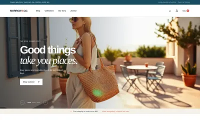
Template Preview
See what your landing page template will look like
What Makes a Great Online Storefront?
Great storefronts succeed when they:
- Make browsing effortless — filters, categories, search, and visual navigation.
- Showcase products beautifully — high-quality imagery with hover effects.
- Surface bestsellers and new arrivals — help customers discover what's popular.
- Build trust at every step — reviews, ratings, security badges, return policies.
Essential Sections
1. Hero (Promotional Carousel)
Full-width carousel with 3 rotating banners. Each: headline ("Summer Sale — Up to 50% Off"), lifestyle background image, and "Shop Now" CTA. Auto-rotate every 5 seconds. Below: announcement bar with free shipping threshold.
2. Category Navigation
Horizontal pill bar: All, New Arrivals, Bestsellers, Sale, Clothing, Accessories, Home, Gifts. Clicking filters the product grid for focused browsing.
3. Product Grid
8 product cards in 4-column grid. Each: product image (hover shows second image), name, price (with sale price if discounted), star rating, "Add to Cart" button on hover, and badges ("Bestseller", "New"). Quick View modal on click.
4. Featured Collection
Wide banner highlighting a curated collection ("Summer Essentials"). Background image with overlay text and "Shop the Collection" CTA.
5. Bestsellers Section
"Top Sellers This Week" + 4 product cards in a row. Each: image, name, price, rating, review count, add-to-cart button.
6. Customer Reviews
3 review cards with customer photo, name, verified purchase badge, star rating, review text. Aggregate rating: "4.8/5 from 12,000+ reviews."
7. Newsletter & Social
Two-column layout. Left: "Get 10% off your first order" + email input. Right: "Follow us" + social icons + Instagram grid placeholder.
Design Guidelines
- Clean sans-serif typography: Inter throughout. Let product imagery provide color.
- White background: Products should pop against clean backgrounds.
- Sale items in red: Create visual contrast for discounted items.
- Hover effects: Image swap on hover, button reveal. Make browsing interactive.
- Mobile: 2-column grid: Compact but browseable on small screens.
Getting Started
Start with this online storefront template, add your product catalog, and launch a beautiful shopping experience in minutes.
Frequently Asked Questions
Ready to Open Your Online Store?
Start with this online storefront template and showcase your products beautifully.